


ABOUT
Bridge is a faith-based organization that ministers to people with disabilities. It provides sevices such as case management, events for the spirit, and medical equipment donation and pickup. In the class of Human Centered Web Design, we collaborated with Bridge to design and launch their new website.
ROLE
User research, information architecture, interaction/visual design, usability testing
The old Bridge website does not meet user & organizational needs.
Learn from Data, Competitors, People & Experts Using 5 Research Methods
We applied several different research methods that had various design implications for our project.
Read another case study
BRIDGE WEBSITE REDESIGN
To design a website that effectively conveys the organization's identity and programs, and satisfies visitors' inquiries.
TEAM
Lingshuang(Liz) Chen, Visual Designer
Kristin Kinnamon, Content Strategist
Lukas Eiermann, Project Manager
Allison Chambliss, User Researcher
Jordan Vincent, Web Developer
TIME
03/2015 - 06/2015 (10 weeks)
IMPACT
The website was launched in October, 2015 by Bridge and they've been managing and updating the content since then. The staffs are very happy about how the new webiste look and how well it works.
THE PROBLEM
THE PROCESS
or, Back to Work
THE GOAL
After the stakeholder interview, we identified five main goals and the measure of success for the new website.
THE SOLUTION
The website was implemented by Bridge in October 2015. Though there's difference in some visual element, the overal design and functionality remains the same.
QUANTITATIVE DATA ANALYSIS
By analyzing Google Analytics and Crazy Egg data we got a very good understanding of the top user tasks. Most new users came through Search and landed either on one of the mobility pages or on the homepage and then went from there straight to the mobility pages.
STAKEHOLDER & USER INTERVIEW
Our Stakeholder and User interviews confirmed that the mobility section really is the dominant reason why most people visit the site. The interviews and the usage data also showed us that new users mostly do not explore Bridge’s other programs. The problem was that even for those who visited the other pages it was not clear what the programs were about, which we also confirmed through the bounce rate on these pages. This was partly due to the overwhelming content on these pages but it was mainly caused by the confusing Bridge terminology.
CARD SORTING
In card sorting we asked the participants to re-organize the content on the current website. We found that it was very hard for new users to understand the label and group the the content from Bridges website.
SURVEY
We also used an online survey to learn more about the current users of the Bridge website. Their main tasks where seeing upcoming events and finding the directions and contact information.
COMPETITIVE ANALYSIS
From our competitive analyses, we learned that we would like to include clear and visible calls to action on every page and create a navigation that focuses on primary user tasks. This is very important for the donating function, as the organization would like to increase the number of online donations. The visual design should be clear and concise with text that is sized and has good contrast for minimum accessibility. The homepage should clearly indicate what the organization is and does along with personal stories about the people who they help.
Visualize Target Audience with Persona
Based on the research data, we generated 5 personas (3 primary and 2 scondary) to further build empathy with different user groups.
Why persona and tasks matrix
-
The process of analyzing tasks matrix and identifying the primary personas helps us stay focued on the primary needs of intended user groups.
-
Persona makes the abstract concept of *user* concret: rather than looking at people as isolated individuals with tasks in mind, it considers people's social status, relationship with others, emotions, and the bigger context in which interactions happen between the website and the people.
-
Persona is the foundation for generating realistic usage scenarios, which could be used during the usability test.
-
Furthermore, personas help us communicating the research findings with the client, and getting everyone in the team aligned with the goals of design.
-
However, it requires some effort to educate the client what persona is and how it is different from user segments generated from quantitative data.


Use Design Principles to Drive Design Decisions
To further abstract the needs from users, the requirements and values of Bridge, we identified four principles for the design of the website:
Accessible
Given the fact that many of the donors are the elderly, and most volunteers are immigrants from east Asia, the accessibility of text, color, symbol and language should be carefully considered when design.
Simple
Because caretakers and people with disabilities already face more hassels in their lives than others, it is important that the website is simple to navigate for people with different levels of technological skills.
Credible
Since we want to encourage behaviors like donations of money and equipment, it is important that the website convey the sense of credibility and trustworthy.
Encouraging
Given Bridge's mission to help people with disabilities live full and meaningful lives, the website needs to convey the sense of welcoming and encouraging while illustrating people with disabilities.
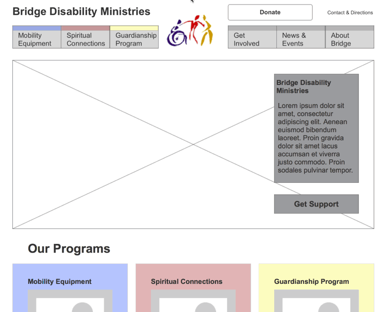
BIG HERO IMAGE
HIGHLIGHTED PROGRAMS
CONSISTENT NAVIGATION


We wanted to have a big hero image featuring a person in order to show the human side of the organization with a tagline that gives the user a quick introduction to what Bridge does.
Many people come to Bridge for information on the Mobility Center and we wanted to make sure that they could easily find out about what else Bridge can do for them.
We also wanted to have sidebar navigation on all landing and sub-pages for ease of use and accessibility.
Sketch & Major Design Decisions
My Reflection & Learning
Overall, I feel very proud of our project, not only about how much better the site had become, but also how many lives the site has impacted. Everything paid off when I saw the smile on the user's face. However, there is always room for improvement:
Timeline left little room for design and development
It was a 10 week class with a emphasis on research and ideation. But it's also important to leave us enough time to design, test and review site implementation so that there aren’t bugs and unexpected issues for users, which is also part of user-centered design(UCD) process.
Mobile first approach
Though currently 68% of the total visitors come from desktop device, it's highly possible that more and more people will visit the site from mobile devices. Given more time for design, we would try to design the mobile site first, and make it a responsive website.
Team needs to both collaborate and specialize
UCD is supposed to be collaborative, and our team worked together on most parts of this project. But that slowed us down, and we probably should have specialized a bit earlier.
Beware of scope creep
Often this is a client issue, but in our case, we came up with plenty of our own ideas to make our project harder. For instance, we ended up identifying 8 different page types – resulting in 8 templates for graphic design and coding. We imagined new forms for the organization and new processes.


The staff at Bridge gave us a tour inside the mobility center, where people donate and check out medical equipments.


Increase Financial Donations
Attract More
Volunteers
Increase Visibility of Programs and Partnerships


Make it Easier for
Equipment Donation
Increase Visibility of Updated Content
In the screenshot from Google Analysis and Crazy Egg result, we can see that people are really interested in equipment (65% of link clicks were taken by Available Items/Do You Need Equipment). While the two links redirect to the same page, most people click on the second link.
Task Matrix
With the task matrix, it is easy to identify that "Learning about Bridge mission" and "Mobility Center hours & location" are the most commonly needed information across user groups, followed by "Understand Bridge (the 3 programs)".


Because the mobility center was so important we gave it its own section and put the other programs in a separate section. This gave easy access but it wasn't very consistent.

In the next iteration we had clear separation but we ended up with a 4 level deep navigation.

The solution was an iA that only contained two levels. A landing page for each section and the individual content pages. We also moved the three programs to the first level so they would be visible from any page.
Because the mobility center was so important we gave it its own section and put the other programs in a separate section. This gave easy access but it wasn't very consistent.
Creating an easy to understand Information Architecture(IA) was the main challenge for our project. There were three goals we tried to achieve in constructing the IA:
-
Allow easy access for the main tasks
-
Give visibility to all of Bridges programs
-
Help users to understand how the programs can benefit them
Reorganize Information Architecture
Each of us sketched out home page and a landing page separately, and came together to discuss their pros and cons. There were 3 main features that we decided to incorporate into the next step of wireframing:
First Prototypes in Axure
Axure Protoypes enabled us iterate the layout, create first interactions and test our ideas with users.
The first prototype features the three points:
-
960 grid and large font for accessibility
-
Color as indicator for different programs
-
Mega-menu with details about individual programs
After testing our prototype in class, we found that we did a good job of highlighting the programs but needed to clean up the homepage. We shortened the descriptions on the homepage, made our headlines actionable, and took out some unnecessary content to reduce clutter.
Internal Critique & Iterate on Prototype
Test with Users & Stakeholders
We then tested the new iteration of our prototype with some of our users at Bridge. We found that the users could complete most tasks easily, but found some pain points in the content. To address these pain points, we made some changes to the content and plan to communicate our findings with Bridge when we hand over the website.
One participant was testing with the home page prototype.
Build Identity & Better Experience with Visual Design
Driven through Style Tiles & Feedback from Clients
Firstly, I studied Bridge’s current visual style by gathering the existing marketing material, the brochure, poster and logo. I found that currently Bridge doesn’t have a clear visual style guide to follow, except for the logo and the three theme colors.
Then I decided to figure out a style guide for Bridge. I asked the client three adjective words to describe the mood they want to convey to the users. They came up with these words: welcoming, caring and strong advocate, partner and leader.
Based on the three words, I created style tiles for two distinct directions. Our client gave their opinion on the two direction and picked a preferred direction. After I gathered the feedback, I created 3 version of the home page, each of them have different design choice in terms of font, buttons and images. I tested the home page with the users and showed them to our client to gather more feedback.


8 Page Templates in 2 Days
The time left with design and development was very limited, I designed 9 page templates in Sketch in 2 days with exported assets for the developer to implement in the front-end code. I also played the role of a quality assurance to audit any misalignment of the design and the code.
No More Hassle Updating Content by Staffs
A Content Management System Allows Bridge to Control & Update Content Independently
One of our team member suggested using Contentful as a content management system for Bridge. For this project, we used it to design the content, and demonstrated Bridge how to use the tool.
There are several features of the tool that make it suitable for Bridge staff to use:
-
Update content with an easy to use text editor
-
Simply add or delete new pages
-
Secondary content (sidebars, headlines, images, footer etc.) is also editable through the CMS

Support Bridge till Launch
Though the class was finished, we continued working with Bridge to help them bring the website to life. The work we did includede content review, image selection, copyright issue, and other technical issues they had when handing over the work to the contractor. Finally, the website was rebuilt in Wordpress and launched by Bridge.